|
Dr ROBERT ORGAN |
|
ISHIKAWA 2006
|
|
|
|
|
|
|
|
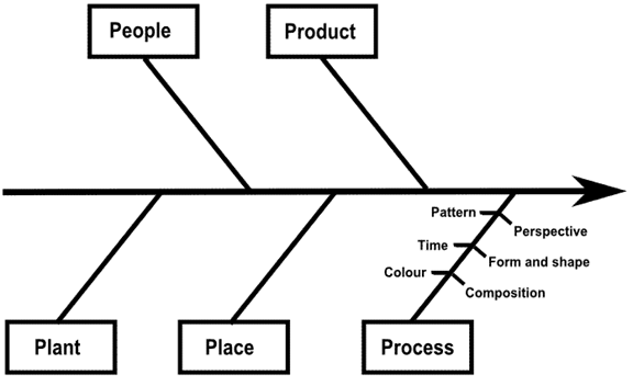
Ishikawa 2006 is a series of photographs which act as a visual interpretation of the Ishikawa diagram, also known as a fishbone diagram. The diagram is a tool used in Quality Management. The concept is that a basic problem of interest (the effect) is entered at the right of the diagram at the end of the main backbone. The main possible causes of the problem are drawn as bones off the main backbone. The Ishikawa diagram in this document identifies the causes of People, Plant, Product, Place and Process . This "5Ps" form of the diagram is one of its more commonly used configurations in business practice. However, it is not exclusive and the key is to have three to six main categories that encompass all possible influences. Further specific causes can be added to create "bones off a bone". This is done off the main Process bone which has been adorned with bones representing fundamental parameters used in visual communication, i.e. Pattern, Perspective, Time, Form and shape, Colour and Composition. This subdivision into ever increasing specificity continues as long as the problem areas can be further subdivided. When the fishbone is complete, a comprehensive picture emerges of all the possibilities that could be the root cause for the designated problem.
Each of the causes and specific causes is interpreted as a series of exactly twenty photographs per cause selected from large archives accumulated for each cause. Keeping the number fixed at twenty is deliberate. It conveys the importance of bringing a disciplined approach to a problem-solving exercise where all causes are given an equal weight before they are evaluated. While this document is not intended to suggest that an Ishikawa diagram is appropriate for evaluation of visual information (a realm where subjectivity is so often important), use of the tool on problems of interpretation and evaluation illustrates that these processes are themselves multi-dimensional and rely on complex interactions between comprehension of events, experiences, emotions, thoughts, ideas and images.
The selection process for the twenty images per cause was difficult, representing a contest between conceptual ideas versus gut feel for compositional satisfaction, i.e. "it looks good". Some cross over from one cause to another is inevitable. Isolating a cause and maintaining the contextual discipline was a challenge and illustrated the importance of strong subject matter and content; the computing expression "GIGO – garbage-in-garbage-out" frequently came to mind during the selection process. Equally important was the feeling that each photograph should be able to be considered individually as well as be appropriate in the group, theme or cause to which it belongs.
People
The series of photographs interpreting
People spans the period 1980 to 1988 and is centred largely in and around the
towns of Pontypool (Gwent) and Cambridge. Its perspective is that of a
person during the change from adolescence (spent in the South Wales valleys)
to adulthood at the time of leaving home and attending University. The
series, initially inspired by the images of the Magnum Group, was later
influenced by the strong documentary photography culture emerging in Wales
through the Documentary Photography course at Newport Art College and the
Ffotogallery’s "Valleys Project". Uniquely perhaps, the
series was taken over a relatively long period of time from the viewpoint of
an insider looking within. While the series does not delve into the
intimate range of any individual’s domestic circumstances, state or range of
activities, it illustrates the huge diversity of activities within the
community; refuge, rebellion, religion, remembrance, recreation, ritual,
rites of passage, education, charity, shopping, work and play are all
portrayed. Many of the recreational activities are repeated in each of
the age groups represented. Indeed, age allows the photographs to be
structured along a temporal path, akin to the "seven ages of man",
i.e. from birth, childhood and adolescence through to adulthood, middle age,
old age and death. Contrasts and ambivalence are evident: poverty and
wealth, working class and middle class, consumerism and charity, revelling
and religion. The eccentric and strange seem to have an innate and
automatic ability to capture attention. Much humour was encountered
during photographing and this is reflected in many of the images. While
glimpses exist of despair, the over-riding emotion is usually that of
momentary gratification underpinned with a strong sense of optimism.
However, little sentimentality pervades the images and any political
dimension is largely absent. This was surprising given that the period
during which the photographs were taken was a time of economic depravation
and social change in the South Wales valleys. The selection of the subject matter derives from an intimate knowledge of the community and was thus entirely deliberate. Composition and shot selection, however, were necessarily spontaneous. Compositional maturation is evident with later work attempting to capture the concept of movement through use of slower shutter speeds and blurring effects. The photographs were taken using 35 mm cameras and black and white film.
Product
After tooling and shelter, some of the earliest objects produced by man, and indeed the earliest artwork, are those of man in his own likeness. The bible even says that Adam himself was created in god’s likeness. The depiction of man as a model of himself is thus extensive and the series of photographs interpreting Product provides a flavour of the diversity that exists in such models. The initial observation in the early 1990s that vernacular models, i.e. technically simple models produced by the general public, seemed to be commonplace in many countries grew into a fascination and an emphasis is also made on these types of models. An increase in contributions to the series from the year 1999 onwards is a result of the increasing fascination.
The theme of ritual and religion pervades the series. The making of traditional idols, such as the strangely-coloured Buddhist temple guard, can be contrasted with the tradition of making models, such as the those for the annual scarecrow festival at Aldwincle. Ironically, the most popular scarecrows seemed to be those depicting current day idols, such as the Beckhams and other celebrities. An appropriate alternative title for the series which reflects this current cult of celebrity worship would seem to be "Pop Idol"!
A full gamete of emotions is expressed in the faces of the models. These often reflect the purpose of the model: warning, enticement, seduction, provision of information, decoration, research and artistic challenge. While some of the models are grotesque, unusual or difficult to understand, most are humorous and easily accessible. The latter is not surprising as many models are used to encourage consumption.
In its business use, the bone/cause of Product in the Ishikawa diagram usually refers to causes relating to materials being used. A reflection of the importance of this can be gleaned from the variety of materials used to make the models: straw, papier-mâché, card, wood, latex, stone, ceramics, glass, plastic and metal. Some of the models are fully three-dimensional while others convey their message through essentially two-dimensional board cut out in the outline of the human form and then painted. A common thread that imbues each model is the importance placed on decoration, particularly colour, even on the models manufactured from the simplest of materials.
The photographs were taken using 35 mm cameras and colour transparency film.
Plant
The word "plant" in the Oxford English Dictionary has a plethora of meanings, four common ones being:
(i) A living organism (noun). (ii) To set into the ground to grow (verb). (iii) An idea implanted in the mind (noun).
(iv) An object implanted to deceive (noun).
The series of photographs interpreting Plant reflect the different meanings of the word and the connotations the word inspires. Of particular interest is the extensive use of images of plants and artificial models of plants for decoration on buildings and in the home, and for commercial uses, such as advertising features. The visual impact of brightly coloured flowers, such as the sunflower and tulip, seems prevalent. Contrasts exist between natural beauty, such as the lichen and wild flowers, and the highly cultivated and tended plants found in formal gardens. Another contrast is the impact that can obtained from single plants and the use of multiple planting.
The photographs were taken using 35 mm cameras and colour transparency film. They span a significant period of time dating from the early 1980s to the present
Place
The late 1980s saw the death of the coal industry in the South Wales Valleys and other industrial areas, such as Wakefield in West Yorkshire. It was another landmark era in the transition from heavy industry to a supposedly service based-economy. The series of photographs interpreting Place documents the changes taking place in the structures and buildings during this period. However, when the project started it became apparent that the change was not restricted to these industrialized areas. While some buildings in affluent towns, such as the wooden beach huts in Bournemouth or Emmanuel College Chapel in Cambridge seemed immune, other buildings in these areas were in change. The pattern of change always seems the same: closure, change of function, renovation and new life or destruction. A recurring observation is the decoration of the disused with posters or bedaubing with graffiti, changing the function to a source of communication. This important concept, building as a form or means of communication, is seen not only in the decaying but is used deliberately; external hoardings on public houses and shops, altar pieces and decorations on churches, placards and banners on private dwellings are all examples of the genre. Indeed, it is the diversity offered by these particular features that define a place and make it different from any other place. To identify and capture these differences, it was necessary to develop an intimate knowledge of the places where the photographs were taken. Their selection was entirely deliberate: details would be noted and photographed at an appropriate time. A sense of irony is evident: the disused Kinema cinema in Cambridge close to the burnt out remains or the Chariots of Fire public house, the inviting façade of the Blaenavon Gallery or the black and white photograph showing a poster with the slogan "liquorice: a colourful history". The series is considered, like the process of change, an ongoing project. The photographs were taken with a medium format camera and black and white film.
Process - pattern
Process is a course of action. It is about transformation. In the creation of a photograph, it is the physical embodiment of visual ideas which rely on the amalgamation of fundamental visual parameters. The series for Pattern contrasts the use of deliberate introduction of regular repeats of a motif for decorative effect in buildings and other man-made objects with the generation of pattern through stacking for storage purposes or random arrangement of objects. The arraying of objects for the purpose of sale again demonstrates a deliberate use of pattern. Process - time The depiction of time in a single photograph initially seems difficult due the fact that most photographs are taken over a fraction of a second. While blurring effects may suggest movement, the ability to freeze action allows prolonged inspection of images and substantial information can be deduced about time from the subject matter, e.g. time of day, random ("one off") or repeated events, reference to historical events (like the war) or memorable occasions. A photograph also acts as memory jog, inspiring recollections and feelings . The series for Time captures these dimensions.
Process - perspective
Three themes are illustrated in the series: (i) The unique ability of the camera lens to alter perspective, e.g. foreshortening effects using telephoto lenses. (ii) The ability of the photographer to select a desired perspective of the subject, e.g. vertical, horizontal, above, below. (iii) The ability of the maker of an object to introduce the notion of perspective into the object.
Examples of the latter include the use of "lead-in" lines on buildings, distorting the shape of the body to emphasise scale, use of a pointed arm to indicate direction and use of several objects to give multiple perspectives.
Process - form and shape
Two parallel but related themes are illustrated in the series for Form and Shape:
(i) Increasing complexity in shape and form, e.g. circles to outlines of people and eggs to sculptures.
(ii) The transition from two dimensional to three dimensional, e.g. squares to cubes and outlines to models.
An interpretation of the slang use of the word "form" to evaluate the assets of a horse or a woman is also made.
Process - colour
In the series for Colour, primary and secondary colours are isolated. The use of blocks of single colours are contrasted against mixtures of colour.
Process – composition
A composition is an arrangement of parts of a picture, an essay or piece of music. Essentially, it is the act of putting together into the whole. The series for Composition shows a range compositions found on public buildings, giving rise to the alternative title "Extra Mural". Some are just pictures, most are an amalgamation of words and picture. Particularly interesting are the images of graffiti. While some suggest a randomness in preparation, such as the scribbling of a name on a wall, others suggest a premeditated and considered approach. The motives behind the compositions are equally varied: commerce, venting of emotions (such as anger or love), displays of talent and dissemination of information. A feeling of short term transience pervades many of the compositions, i.e. sooner or later they will be removed or replaced.
The photographs were taken using 35 mm cameras and colour transparency film, except for the series for Time where black and white and colour negative films were used. Process is the most recent of all the Ishikawa series with most contributions dating between 1999 and 2006.
Click on the causes on the left hand side of the screen to see the photographs.
|